Brian Vinall, Operations Manager at the Flood Forecasting Centre for the Environment Agency, worked with a team to develop the Flood Guidance Statement, which provides Category 1 and 2 responders with information to help them with emergency planning for flood events. Here Brian talks about why the statement was created, the data used to produce it and the impact it has had.
Explainer
What story does this visualisation tell?
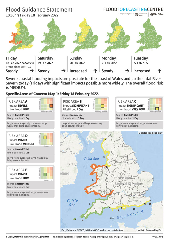
The Flood Guidance Statement (FGS) is a classic example of showing complex information spatially in an easy, digestible way. The statement is a predication of the probability of rainfall, flooding, a coastal event, a groundwater event, or a surface water event occurring by county for England and Wales. It’s really quite complex, we’re analysing something crazy like 5,500 data points per county so that we can give each county either a red, amber or green colour code for the probability of flooding occurring in that area over a five-day period. It’s displaying a lot of really complex information in a easily digestible way for a non-technical audience, mainly Category 1 and 2 responders, as outlined by the Civil Contingencies Act.
Why was it created?
We had some bad flooding in 2007, where approximately 55,000 properties flooded across England, including in Gloucestershire. I was working at the Environment Agency in flood warning at the time. There was a government review, the Pitt Review, which was a comprehensive appraisal of all aspects of flood risk management in England following this event, which produced a list of recommendations on flood risk management. One of these was that the Environment Agency and the Met Office work together to do longer range forecasting of potential flood events.
Up until this point, the Met Office were focused on long range forecasting for weather, but because they didn’t know about antecedent conditions on the ground, they couldn’t forecast the impact of that weather. Whereas the Environment Agency (which at the time had responsibilities for both England and Wales) were using hydrographs to predict when rivers would flood based on certain thresholds, to inform their flood warnings. So there was a disconnect between data on the weather, river and ground response and then emergency responders actually receiving any warning of a potential flood event.
Now, because of the Pitt Review’s recommendation to use probabilistic forecasting, we have merged these two sciences to form hydrometeorology. We train meteorologists from the Met Office and hydrologists from the Environment Agency in hydrometeorology and we now have a 24/7 response centre. As we’re dealing with probabilities, we use a matrix which maps likelihood of the event happening, against the impact of the event. We only have one red box in the matrix, which is the top right-hand corner, this means there is a very high probability that a significantly bad event is going to happen.
Who was the intended audience?
The Pitt Review initially wanted this forecasting to be for Category 1 and 2 responders only, so it wasn’t intended for public use. However, after a flooding event down in Cornwall in 2009/2010 the government started to encourage an agenda of open data and for information like this to be public. So now we have a public version of the FGS on the government website, and we also have an API which means that information from the FGS can be used in apps and websites too.
It’s worth noting that because the risk assessment of flooding that we produce is based at the county level and not individual postcodes, it’s not as targeted as what the public might like it to be. So it’s up to the emergency planners of the county to decide how to spread their resources across their area to ensure that they are prepared for any potential event which might occur in the county, and how to inform residents.
What data did you use to create it and why?
For the assessment of risk for each county we start by using the Met Office meteorology models. Because we’re looking at longer term probabilities we make use of something called ensemble forecasting. This uses the incredible power of the Met Office Supercomputer to predict various probabilities of weather occurring. We also have our own hydrology model called Grid to Grid, which is a 1km grid of England and Wales which uses the river and weather data in each 1km area. We also have this running in ensemble in the supercomputer too. The final decision on what risk to assign each county for each five-day period ultimately lies with our trained hydrometeorologists.
The FGS itself is a GIS system which runs in the background and is simply a visualisation system hosted in the Cloud. It uses GI data which draws polygons of risk on a map which then maps onto the counties in England and Wales.
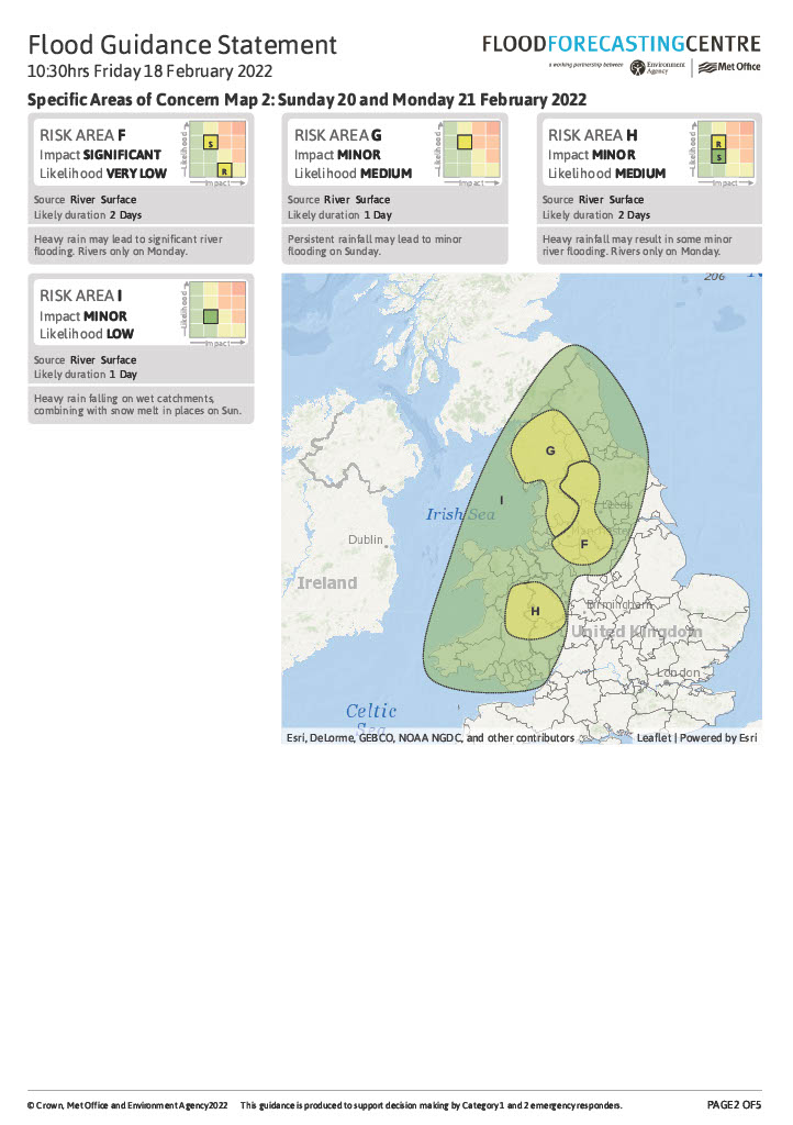
For the FGS we provide overview maps where each county is a colour and then we also have area of concern maps which delve more deeply into the probabilities of flooding occurring in certain counties at higher risk of a flood event in that five-day period.
Of course, one of the challenges we have is that there are certain large counties, like Powys in Wales for instance, where only a very small portion of the county might be at a higher risk of a flood event, but if the polygon clips the county boundary then the whole county turns that colour. That’s why the area of concern maps are important as they provide a deeper view of exactly where in the county the higher risk is.
What impact has the visualisation had in research, policy or other contexts?
We’re all about being prepared and taking precautions. We’re ingrained into the emergency planning response of the UK, which means there won’t be any emergency response to floods unless we have done our job which is quite a responsibility!
We brief at COBRs and escalate any flood risk to the emergency planning community as early as possible so that they can start thinking about what’s needed, whether that’s fire and rescue teams, water rescue teams, rest centres, mortality centres, rostering of staff etc. The Environment Agency and Natural Resources Wales can also deploy flood defences and ensure that assets and kit, like the Thames Barrier, are working as needed. We can also involve the military in the response too, so there’s a lot going on in the background to be prepared for flooding.
We provide a Flood Guidance Statement every day, and because it’s a GI system we can easily pass this information on to the government website and also to the Met Office hazard manager system where you can overlay lots of different hazard data. We also pass the information on the Environment Agency who use it to help inform any flood warnings they are putting out too.
Probabilistic forecasts are very difficult to communicate to the public and there’s often a difficult line for us to tread. We’ve found the Met Office storm naming system helps too so that we can name incoming weather and possible impacts in a more public and media friendly way.
When we forecast for Category 1 and 2 responders, because we use probabilistic forecasts we are not saying that an event will definitely occur. We highlight to emergency responders the chance of a Reasonable Worst Case occurring – asking them to be prepared if it does happen. This was the point of the Pitt Review – you’d much rather be prepared and stand down those measures, than not have those measures in the first place and the worst happen.
What impact has the approach you have taken had in this area?
We were actually the first to implement the science of hydrometeorology in the world and we do often provide support to other countries internationally with their flood risk planning. We use the model of risk management for our work, as do most organisations when thinking about hazard and risk management. I was part of one of the Society’s Disaster Risk Management Professional Practice Group’s events where we discussed the insurance industry and risk management in this space too.
I also contribute to a Government East Coast Flood Group which is formed of local resilience partners to plan for potential future flood events and to ensure that a well thought out, joined up response takes place. If the worst case east coast flood were to occur, potentially millions of people could be displaced out of their homes, so it’s important that we have a response plan in place.
Try it yourself
What are the challenges that someone would have to consider if they’re thinking of doing something similar?
In terms of communicating risk and uncertainty, our biggest challenge comes from expressing risk across a county spatially. As we’re looking at probabilities, we have to think about either over-warning or under-warning different communities and this is hard to express across a large county area – do you warn and it not happen, or not warn and it ends up happening? Some counties, like Powys, are huge – if our polygons go slightly into the county, it puts the whole county at that risk level, even if 99% of the county is not at risk.
We try and warn by county so that an emergency planning response can be put in place, but it is pretty subjective as to what is a significant flood - we’re trying to frame it at the national level, but in a local area where 150 homes have flooded, that’s significant to that community.
About the creator
Brian Vinall is Operations Manager in the Flood Forecasting Centre, based in Exeter. He joined the Environment Agency in 1997, initially working in the water resources team, before working in Flood Warning as a Team Leader. Following the 2007 floods, and the subsequent government review, Brian helped set up the Flood Forecasting Centre. He is also a Government Head of Geography in Analytics Function and a Chartered Geographer Assessor for the Society.
You can find out more about Brian in his LinkedIn profile or follow him on Twitter.