James Cheshire, UCL
“If you can’t convince them, confuse them.” If you watched the UK government’s COVID-19 briefing to announce and England-wide lockdown, you might have been reminded of this quote by Harry S Truman. Following slide after slide of maps and charts, there was growing frustration about the way nationally important statistics were being presented to the public.
Getting these things right is important. We’ve seen previously and in this pandemic that trust in government influences whether people follow public health guidelines. And in a UK survey earlier this year, those who had low levels of trust in the government’s ability to handle the outbreak were twice as likely to think its response had been confused and inconsistent. While a set of confusing slides won’t alone dictate how people behave, these things add up.
We don’t need high production values, or even much polish – it’s nice to feel like we’re seeing the latest data rather than something endlessly adjusted – but being comprehensible and looking professional will help support the message. At the moment, these slide decks are reminiscent of rushed conference presentations pieced together while the previous presenter was speaking. Here’s how to fix that.
Explain your working
Perhaps the biggest betrayal to an audience eager to understand is the phrase “as you can see”. It’s repeated many times at these briefings, and it’s too quickly followed by “next slide please”. The information shown is complex and takes a moment to digest. The presenters – the UK government’s chief medical adviser Chris Whitty and its chief scientific adviser Sir Patrick Vallance – need to slow down.
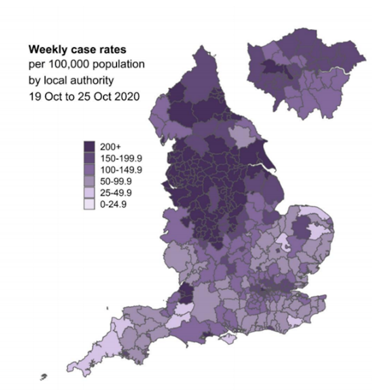
On the map below from briefing in question, how many of us noticed that the weekly case rates per 100,000 people didn’t increase by the same amount each time in the key? We had intervals of 25 for the first two categories, but then jumps of 50 until 200+. The map’s design also failed to show that the rate far exceeded 200 cases per 100,000 people in some areas. Wigan, for example, had 622 cases per 100,000 people.
 www.gov.uk
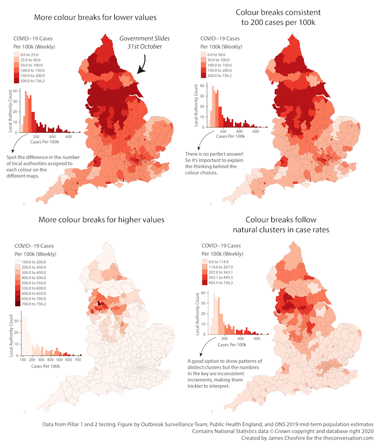
One goal of a map maker is to reveal patterns that may exist in the data, and colouring is key to this – they have to decide when to move from one colour to another. In some cases it’s preferable to split up a narrow part of the distribution into lots of colours and then assign the rest to a few. Or you might assign each part of the distribution equally. Either is fine, but it needs to be explained, or else it’s a nuance that will get missed or misinterpreted.
The choice made for this map overemphasises small leaps in small numbers at the expense of big leaps in large numbers. Unless the values up to 25 and those between 25 and 50 had significance in policy, they could have been lumped into 0-50. Likewise, the map suggests anything greater than 200 doesn’t really matter – that a rate of 201 deserves the same colour as a rate of 601. This doesn’t seem right to me. But the point is, this system needs to be explained, because choosing different intervals can create a very different impression.
Consider the following graphs. The top left is the same as the government’s purple one above, whereas the others present exactly the same data, just with different sized intervals.
 Author provided
On this point as well, the presenters made their lives hard by using national maps when most of the action is in cities. These are hard to see at this scale. The maps pulled out London, but should have done the same for other urban areas.
Presentation matters too
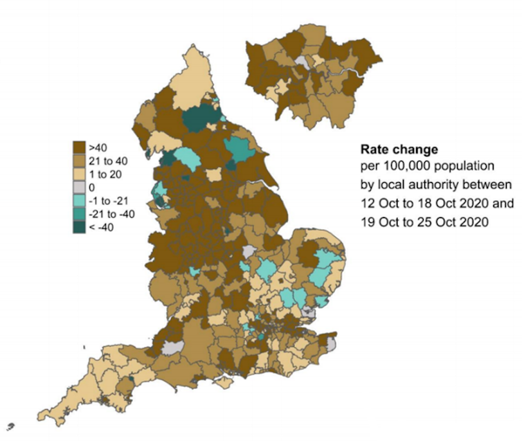
On this map, we were supposed to focus on the dark brown areas – these are bad news. But instead our eyes can’t resist the greens. Whitty had to tell us that the brown areas were what we should be looking at.
 www.gov.uk
These greens and browns are an industry standard colour palette, but more intuitive alternatives exist, such as light blues for slowing rates and darker reds for the increasing ones.
Many people online also complained that the slides didn’t fit the screen. This was an error seen on the BBC only, which had set them up wrong, and wasn’t the government’s fault. However, it does suggest the government isn’t considering what devices people will use to view the press conferences. They appear to be designing for the 50-inch television they are viewing and not for the many people streaming or catching up on their phones.
It’s always a risky strategy to push content right to the edge of slides, as things can get cut off. The layout also failed to account for the chyrons that appear at the bottom of news broadcasts, which could easily have been anticipated and designed for.
Try and keep it simple
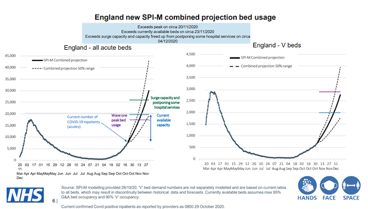
“This is a complicated slide,” said Sir Patrick Vallance as he drew things to a close, forgiving us for not fully understanding it. But this slide was crucial. It was the climax to the case for lockdown. The 16 maps and graphics that came before were just preamble. The two graphs on this slide told us that the NHS would likely run out of capacity to treat the sickest patients in only a few weeks if we didn’t act. It was all he needed to show.
 www.gov.uk
Unfortunately, the dates were misaligned on both graphs (the one on the right takes us to the end of the year, the left mid-December). It’s splitting hairs perhaps, but it demonstrates again that no one took a breather to dot the Is and cross the Ts.
The abundance of acronyms and specialist language is also symptomatic of trying to throw too much at a general audience to build credibility through complexity. This approach risks alienating the audience – when actually there was one key message on Saturday: without lockdown we’ll run out of hospital beds within a few weeks and people we could otherwise save will die.
I want to be clear that I have tremendous respect for the teams of people involved in creating these maps and graphics. I also have sympathy with the scientific advisers themselves, who are treading the increasingly strained tightrope between science and politics. The fact that they are showing such a rich array of data in some quite interesting ways is a really good thing, and we need more of it.
But data visualisation and communication is different to epidemiological modelling. It’s hard to do well, even harder under pressure, though it is possible. Unfortunately, if the government briefings are anything to go by, it remains an overlooked and undervalued skill.
James Cheshire, Professor of Geographic Information and Cartography, UCL
This article is republished from The Conversation under a Creative Commons license. Read the original article.