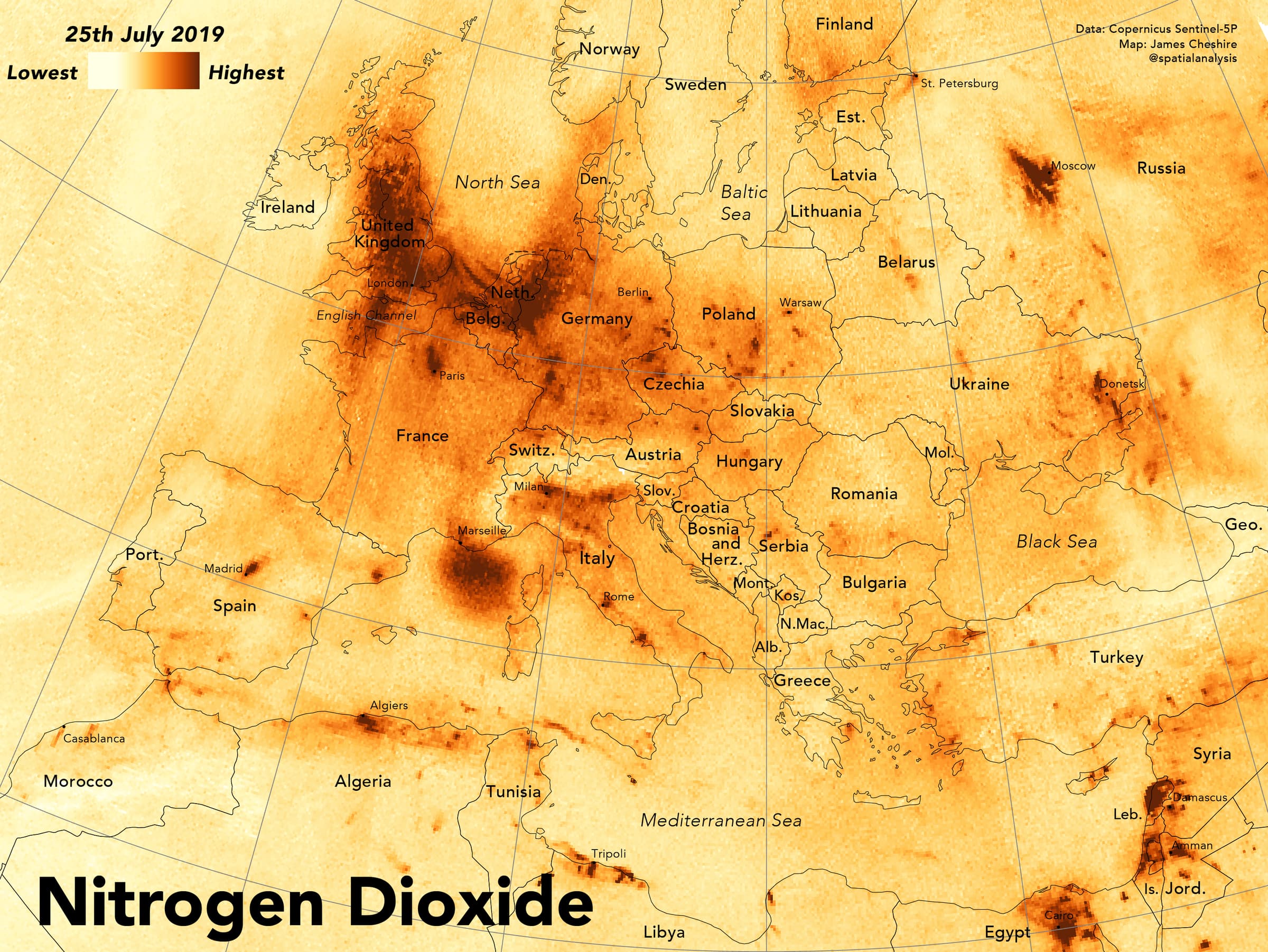
James Cheshire, Professor in Geographic Information and Cartography (Department of Geography, UCL), created a visualisation showing the distribution of nitrogen dioxide across Europe on the hottest day of 2019 in the UK. Maps like this allow us to better monitor air pollution levels and understand how heatwaves affect air quality, making future forecasts more accurate.
Explainer
In this video, James addresses questions such as why he created this visualisation, what impact he is hoping it will have, what data he used and how similar datasets can be used.
Try it yourself
The data used in the visualisation have only recently been made available, so it is still a bit tricky to use if you haven’t had experience with satellite data or R/ Python. As time goes on, it will get easier as more people integrate into online web mapping.
The raw data can be found on Google Earth Engine and also on the Sentinel-5P data hub. Presently, this dataset is still in the 'Pre-Operations' phase so it's not yet available on the full range of platforms and websites where other Sentinel datasets appear.
If you aren’t interested in the pollution but want to see a range of other analyses, the best website to use is Sentinel-hub Playground. ArcGIS online has some Sentinel 2 layers as well.
For those interested in getting stuck into the data, James recommends Arcgeospatial Python tutorial or R tutorial if you use R (this is the tutorial he used for his visualisation).
About the creator
James Cheshire is Professor in Geographic Information and Cartography (Department of Geography, UCL), Deputy Director of the ESRC Consumer Data Research Centre, and Director of the UCL Q-Step Centre.
His research focuses on the use of 'big' and open datasets for the study of social science. He has published in a range of journals on a variety of topics including the use of cycle hire schemes, the spatial analysis of surnames and new ways to visualise population data. James is the recipient of a number of major awards from the Royal Geographical Society (with IBG), The North American Cartographic Information Society, and the British Cartographic Society.
Aside from his academic outputs, he's the co-author of The Information Captial and Where the Animals Go.
To find out more about James' work, visit his website or follow him on Twitter.