Dr Flurina Wartmann, Lecturer in Geography and Environment at the University of Aberdeen, and her colleagues mapped tranquil hotspots in the Loch Lomond and the Trossachs National Park area using social media data. Here Flurina discusses why they created the visualisation, the techniques and data that were used to produce it and the impact the map has had in wider contexts.
(c) Flurina Wartmann
Explainer
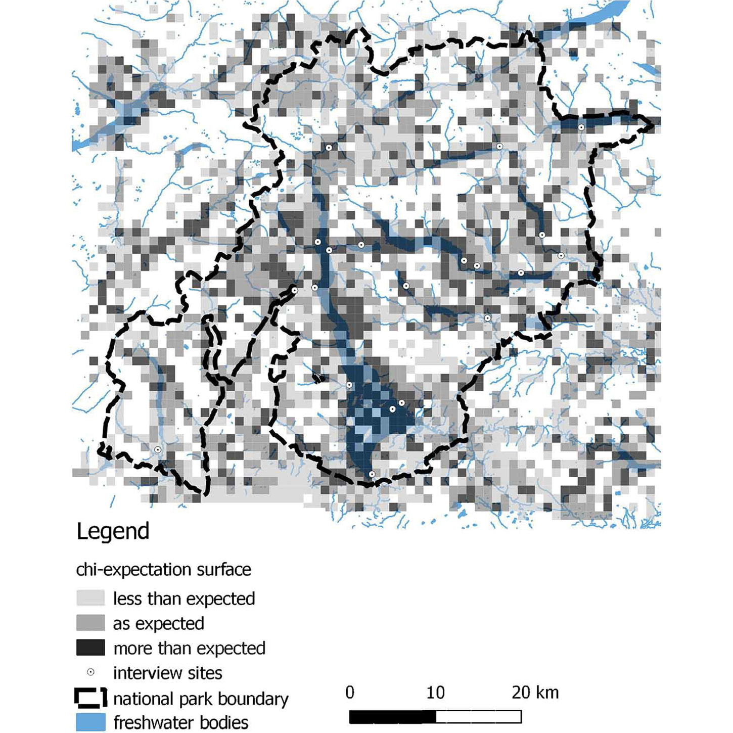
What story does this visualisation tell?
This map shows where people uploaded more, or less images than expected to the Flickr photo sharing platform. It indicates areas along the major water bodies in the Loch Lomond and The Trossachs National Park, that are especially sought after for their tranquillity – even when these areas are busy or noisy.
Why was it created?
Tranquillity is an important quality of landscapes that people often seek out in order to relax and wind down from their busy lives, and tranquillity maps are important for policy-making to protect and enhance tranquil areas. To date, these maps have mostly been produced using GIS models that highlight where tranquillity potentially exists – usually in relatively remote places far from noise.
This map was created to provide an alternative viewpoint on tranquillity – not to show where it is most quiet or tranquil, but where people actually go in order to experience tranquillity. We used social media photographs from Flickr which had coordinates attached to them, looked at specific tags and keywords related to tranquillity and compared this to the overall distribution of geolocated photographs.
Who was the intended audience? What other audiences might be interested?
The audience of this map was for people interested in tranquillity mapping, and anybody doing research on user-generated content and outdoor recreation. We also exchanged our results with staff at the Loch Lomond and the Trossachs National Park, and it was interesting as our results confirmed what staff knew from years of experience. Many people enjoy picnic spots that are accessible with motorised transport, but still provides a feeling of being in nature and away from it all. This research provided tangible evidence for that, and that infrastructure projects which improves access to loch shores and creates easily accessible facilities improves the visitor experience.
-crop.png?ext=.png)
Image: Blue Hour at Millarochy. Rob Donnelly on Flickr (CC BY-NC-ND 2.0)
What data and technique/approach did you use to create it and why?
I first conducted interviews with almost 100 visitors throughout the park and asked them what contributed to their experience of tranquillity at the location they were in. Having collected these single word responses that were positively associated with tranquillity, we then searched for georeferenced images on Flickr that matched any of these keywords. We calculated an expectation surface that shows where we found more images with tranquil keywords than expected if we compared it to all images on Flickr for this location, and where we found less than expected. These ‘hotspots’ of tranquil images are an indication where many people experienced a sense of relaxation and tranquillity.
Why did you choose to present the data in this way over other approaches?
We chose an expectation surface rather than showing counts of images, because counts mostly show overall hotspots of photographs, and the chances are that at least some of these photos will contain at least one keyword related to our search. But if we find a spot where there aren’t many images, but a lot of them have a certain tag or tags such as ‘tranquil’, ‘quiet’ or ‘serene’, then this tells us something interesting about that place.
What impact has the visualisation had in research, policy or other contexts?
The map and associated research has started conversations about what we take as a basis to define tranquillity. While the absence of noise is important, our research shows that people may often enjoy tranquillity not in the quietest areas, but at the fringes of tranquil areas that are more accessible. And while protecting quietness is important, we hope our research also starts conversations among policy-makers and landscape managers about the importance of making tranquillity accessible without destroying it in the process.
Try it yourself
If you want to try this out yourself, you can explore georeferenced photographs on the Flickr platform (https://www.flickr.com/map) and try searching for certain keywords. If you want to access the data, you can use the Flickr API and download images and their tags for the area that you are interested in. Flurina and her colleagues then used QGIS to display the points and to calculate the expectation surface using a second data set containing all images for their study area.
About the creator
Dr Flurina Wartmann is Lecturer in Geography and Environment at the University of Aberdeen. Her research revolves around people and landscapes, and is particularly focused on assessing landscape perception and people’s relationships to particular landscapes.
You can find out more about Flurina and her research on the University of Aberdeen’s website.